
Charting a Unified Course.
After almost 100 years of growth, The Navigators had evolved into three branches and 11 subgroups—each with their own separate branding. They had become a “house of brands” instead of a “branded house.” And in the midst of the noise, the organization’s message and mission were getting lost.
Discover
Our research uncovered the core values that connected every branch, subgroup and chapter. Then we used those insights to create a brand positioning statement that spoke to every subgroup—uniting them under a single mission while inspiring them to make it their own.
Develop
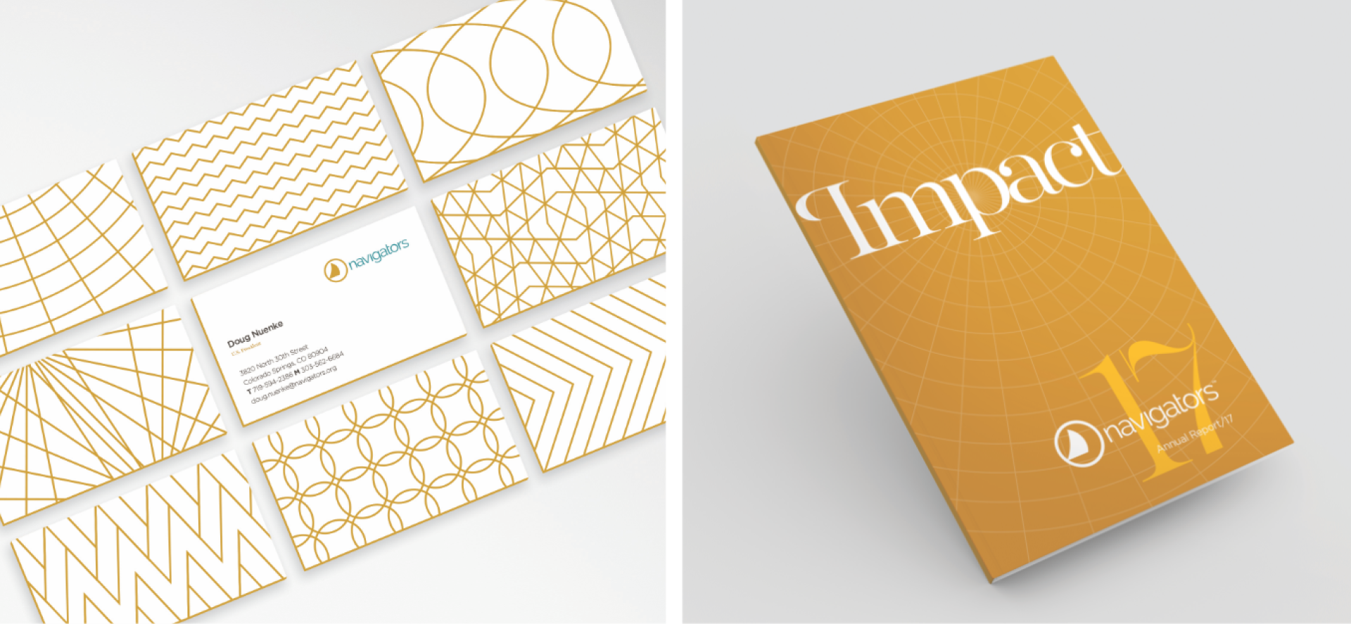
Our goal was to strike a balance between The Navigators heritage story and the critical need to update and unify their branding. We kept the color palette in the same general family, with subtle tweaks to modernize it, and refreshed the logo with a custom wordmark and renewed avatar.
Deploy
Our work brought The Navigators brand back under one roof. The next step was to ensure all entities were on the same page. We created a comprehensive brand guide that focused heavily on messaging, including a glossary of key vocabulary and guidelines for speaking to different audiences.

The Results:

They really ‘got’ what it means to be the Navigators. The final recommendations hit the mark, having been built on an in-depth, involved engagement. If your organization is looking for a fresh perspective on branding, while staying firmly rooted in your core mission, I confidently recommend you consider working with Big.Gary P. Cantwell, Chief Communications Officer, The Navigators