Get the Wheels Terning
An ambitious entrepreneur was ready to manufacture his incredible invention—the Tern craft ice cream maker that brings a fun yet luxurious new twist to homemade desserts. But the final step was to develop a brand identity. Considering our love of ice cream and our passion for working with consumer product start-ups, BIG was more than willing to step in. The entrepreneur had nothing but an idea for the name of the ice cream maker. Everything else, from the brand identity and messaging to packaging and instructional videos, was up to us to develop.
Discover
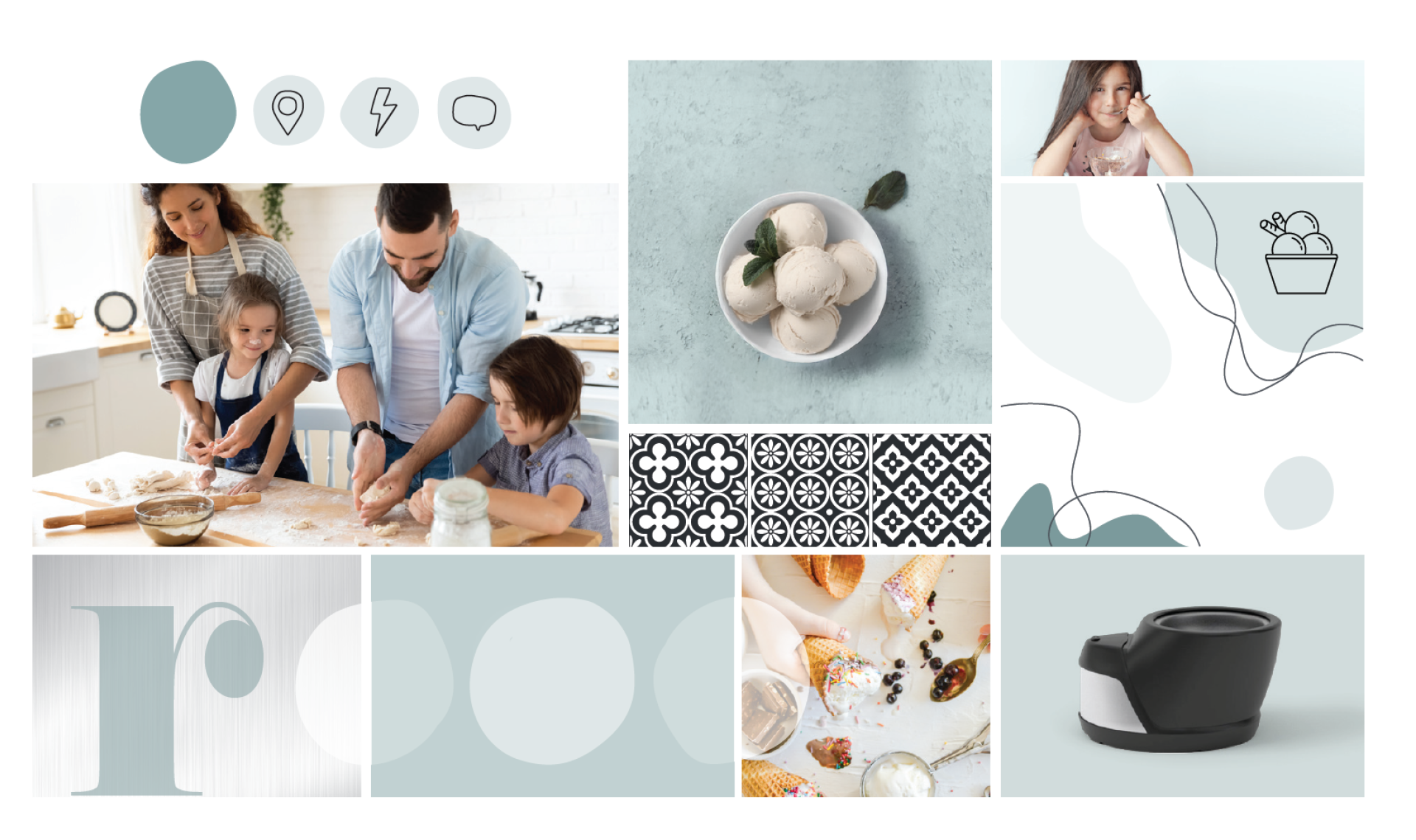
Although our normal brand process involves a lot of research, we’re willing to tweak those steps a little when working with a start-up. Since there were no customers or employees yet, there was no one to interview. Instead, we spent time with the inventor to understand his mission and vision for the company. We found that he was just as passionate about people as he was about ice cream, and his goal was for families to be able to make the highest quality ice cream in the comfort of their own homes. Going off of these ideas, we determined Tern’s attributes were getting communities together, joy, integrity and creativity. We needed to build a brand that both inspired foodies and brought people together.
Develop
Full creative freedom on a start-up project comes with a price—having to make lots of decisions without a lot of background information or context. But we never back down from a challenge. The client’s name idea was inspired by a bird, the Arctic Tern, but he wasn’t sure how to make that work. We collaborated with him, shortening the name to “Tern.” BIG also determined the key product features that would grow Tern’s audience were speed, quality, ease and customization. And the tone we used to describe these features, of course, had to match the company’s joyful and relational personality.
Deploy
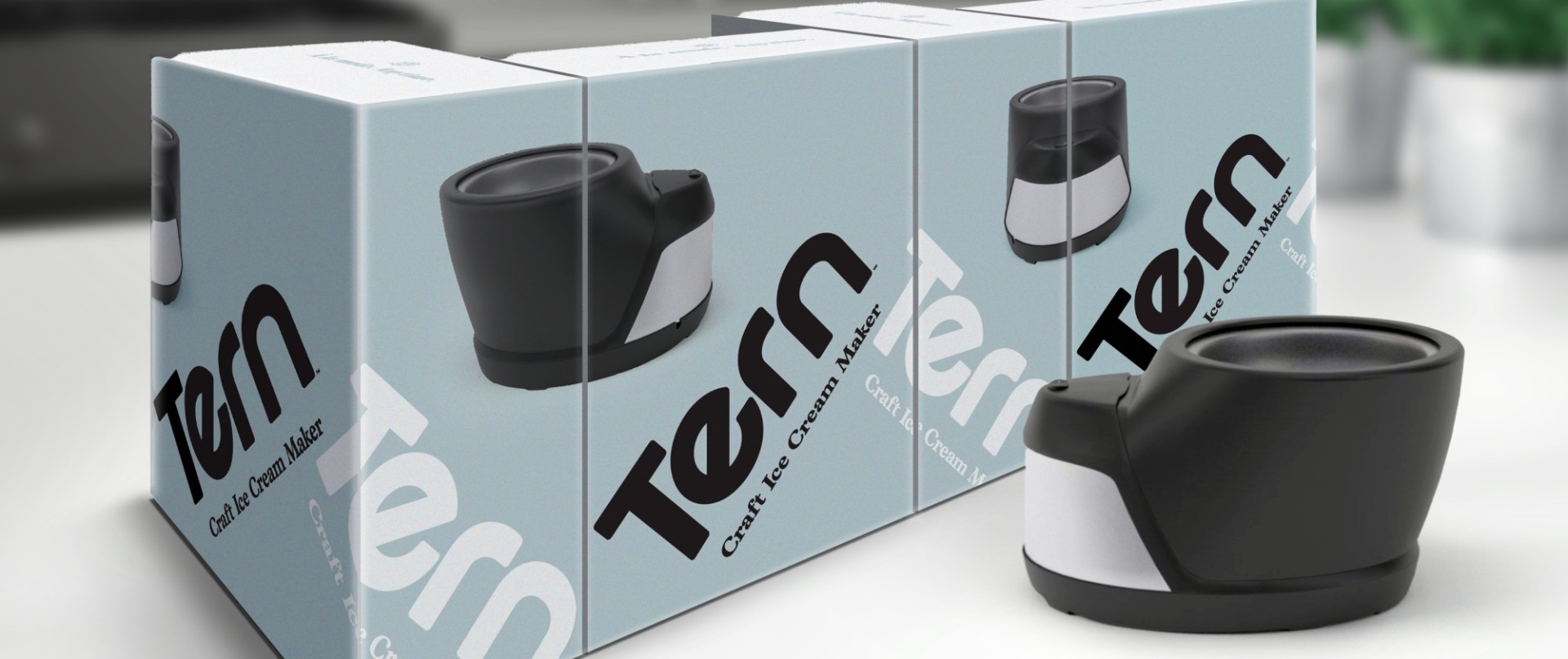
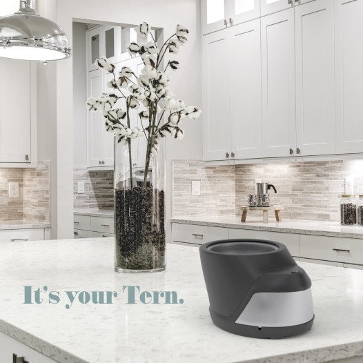
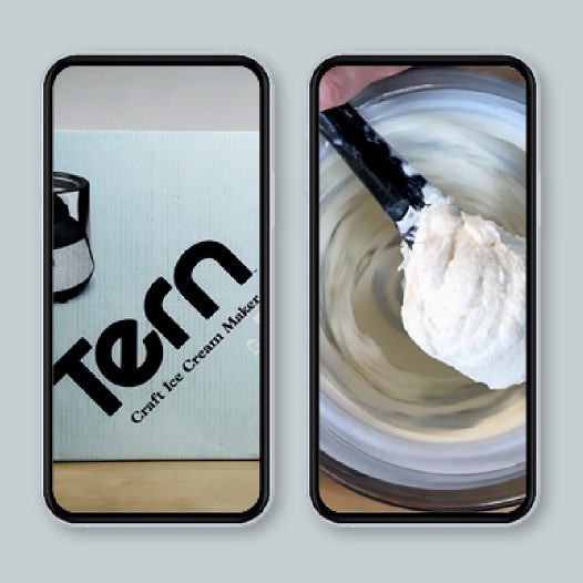
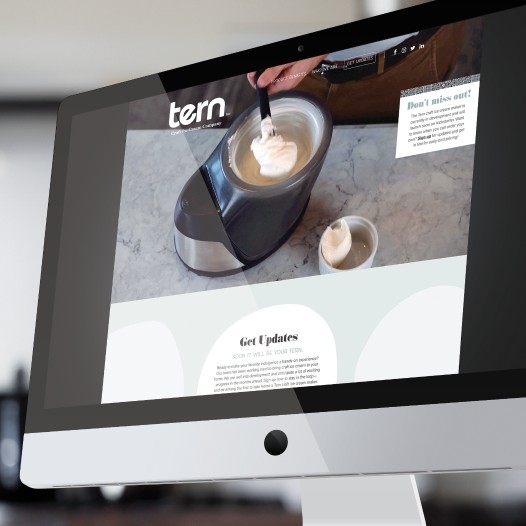
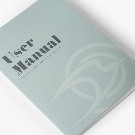
In the end, BIG delivered a sweet brand identity. With kitchen-esque tile patterns, a “cold” color palette—light blue and white—lots of white space and a custom logo that features a tilted “e” to symbolize the spinning function of the ice cream maker, the visual identity hit a perfect balance of luxury and hominess. The verbal identity did the same but with a brand story and headlines that emphasized the fast process, delicious taste and family fun. Along with a beautiful brand to get them started, BIG also helped Tern develop their fundraising campaign, website, Shopify platform, packaging, user manual, various videos, 3D modeling and marketing initiatives. With all the tools in their toolbelt, Tern was ready to launch.
Before BIG was involved, we were stuck trying as best we could to figure out the branding and company identity, wasting a lot of time in the process. BIG stepped in with a level of clarity and professionalism to the process that all just made so much sence. We couldn't be happier with where we ended up and we could never have done it without BIG.
BIG's expertise in branding was apparent from the beginning but it has been so valuable to be working with a full-service marketing company. They know, not just how to be subject matter experts, but also how to leverage the diversity of their team to end up with fantastic solutions. We have seen their varied skills at work in everything from general marketing planning to web design and video production to product packaging and we have a stronger, more valuable market presence because of it. Thank you BIG!
Josh Stuckey, President