Can-Do Branding
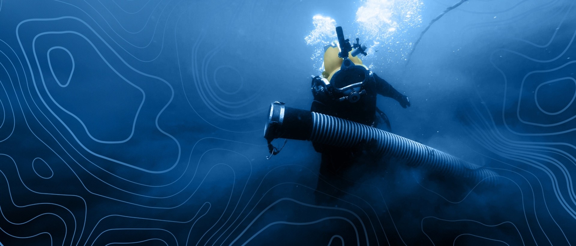
American Underwater Services is a commercial dredging and diving company that offers innovative solutions and decades of expertise. But while they’re great at diving into lakes, they needed help diving deeper into their brand. Their dredging services were expanding, and they wanted to find new ways to stand out against their competition. They needed a brand that reflected how much they’d grown and would keep their momentum going.

Discover
Every brand BIG rolls out is built with distinct strategic, verbal and visual identities—and every one of those parts starts with research. We talked in-depth with both their employees and their customers to get a behind-the-scenes look. Right away, we saw a common thread. Everyone we talked to described AUS as easy to work with, innovative, determined and having exceptional service. We found out they have a reputation for having high standards of client services, creating a stress-free client experience. At the end of the day, they’re the kind of people that get things done. BIG took all of this input, formed tangible attributes and let those form the rest of the brand process.
Develop
Through our research, we concluded that AUS’ current messaging, voice and even the visual identity was focused on how they did their work, but didn’t at all reflect how customers experienced them. From looking at and reading about their company, you immediately knew they were dredging experts, but you didn’t know how they go above and beyond for every client, every day. It was BIG’s job to tell their true story and help them connect with their audience through their brand.
Deploy
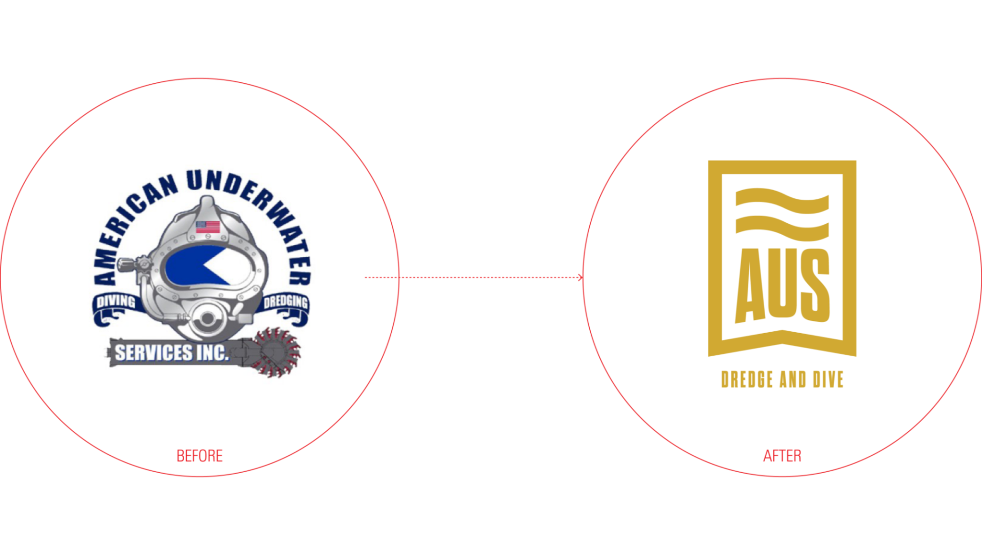
We never get tired of delivering strong strategic, verbal and visual identities, and AUS was no different. We started with the brand positioning statement, which helped us define their brand and set up guardrails for their messaging. Next, we moved on to the name, offering an extensive list of options with rationale and research. Through our collaborative discussions, everyone agreed on “AUS Dredge and Dive,” so they could stay familiar and make their services clear at the same time. For their tagline, our team landed on “Can. Do.” because of their get-‘er-done attitude and eagerness to take on any challenge, no matter how complex. Most importantly for their verbal identity, we crafted a meaningful brand story that would inspire their audience to care about their water and trust AUS to do the job right.
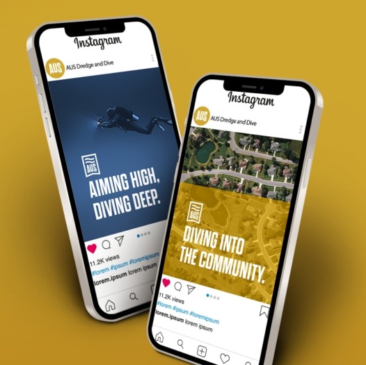
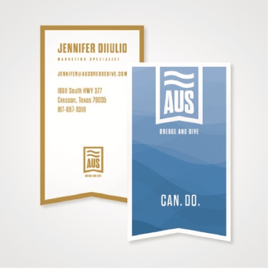
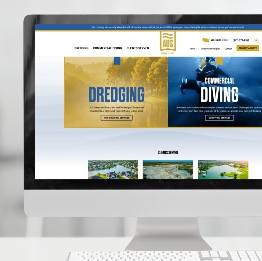
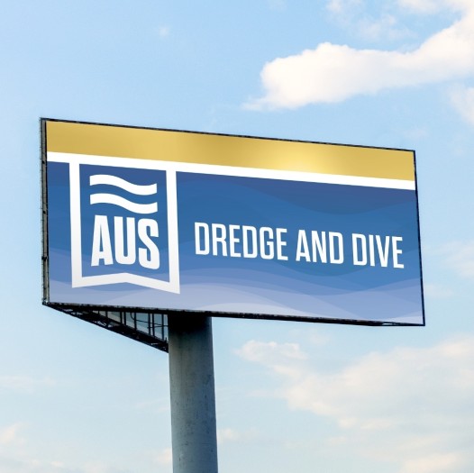
Based on our research, we found that gold represented their attributes perfectly and was a bold symbol of their outstanding talent. Overall, our creative team found a way to show AUS’ audience what makes them not only experts in their field, but also the best teammates you could ask for.
Finally, we used this comprehensive brand identity to redesign their website and freshen up their headlines. Our digital team also moved the site to a new platform and maximized their SEO. With a robust brand and an updated website, AUS had all the tools they needed to put their best flipper forward.
Thanks to their expertise, we’re now poised for our next growth phase with a brand that highlights our strengths and core values. BIG brought clarity to our story, empowering us to share it confidently with the world!
Jennifer DiIulio, Marketing Director
