Taking Care
The Big team has shared its heart and smarts with Matthew 25 for many years. When it became clear they needed a refreshed brand (like, yesterday) we naturally stepped up to help. The result was a new look—and a whole new way of looking at their programs and services.
Discover
Where to start? If you guessed “research” you know us well—and you’d be right. We polled and surveyed the organization’s staff, patients and donors. Their answers told us that while overall awareness was high, there were misconceptions about how Matthew 25’s programs and services had expanded and evolved over the years.
Develop
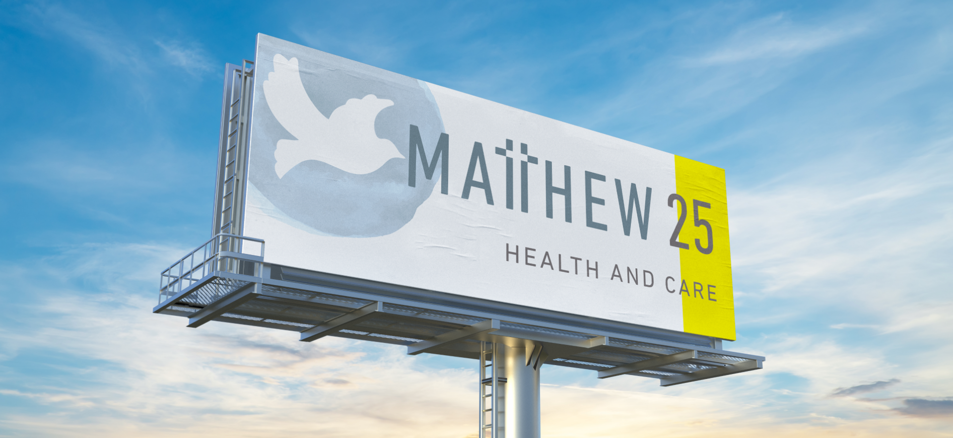
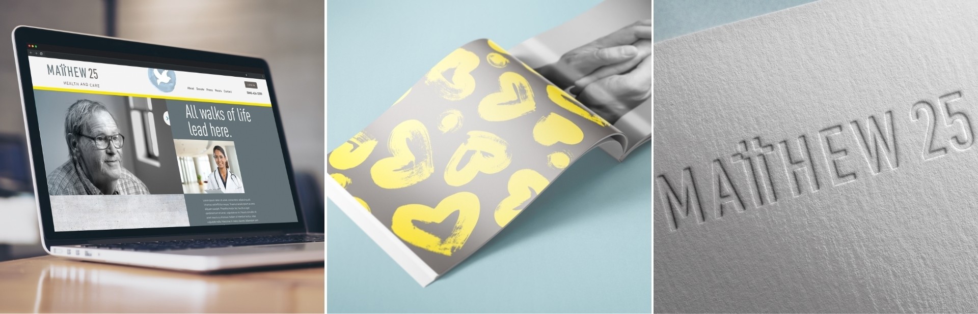
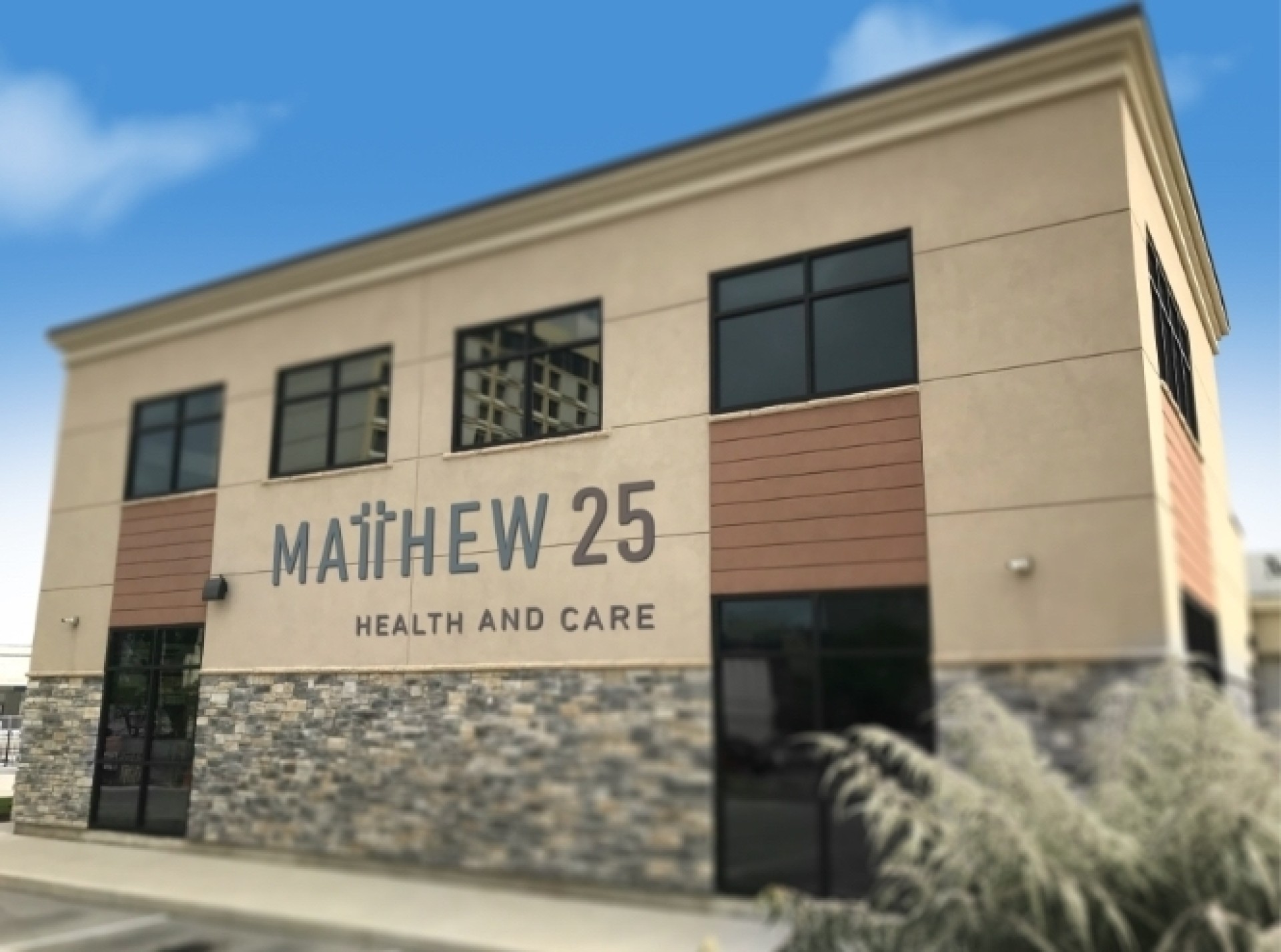
We reimagined the logo, abandoning the dated dove for a cross-inspired wordmark that was easier to read and reproduce, and a better reflection of their Gospel-inspired roots. We also crafted messaging that reiterated their mission and changed their full name to “Matthew 25 Health and Care,” to express the breadth of health and wellness services they provide.
Deploy
It’s a wonder what new branding will do. The new look and name breathed life into the organization, giving them credibility and conveying the depth of their expertise in a single mark. The organization that started as a grassroots “dental clinic” had grown into a full-fledged healthcare provider—and their branding finally looked the part.
The Results:
I don’t think words will be able to do justice to my experience with Big on our branding project. This process has exceeded expectations. I think what makes them special is their value for people and their unique ability to connect with the heart of an organization. As a result, you get a well-refined and authentic brand. The journey with Big was extraordinary and the results are gold!
Allyson Feasel, Board Member, Matthew 25 Health and Care