The Challenge:
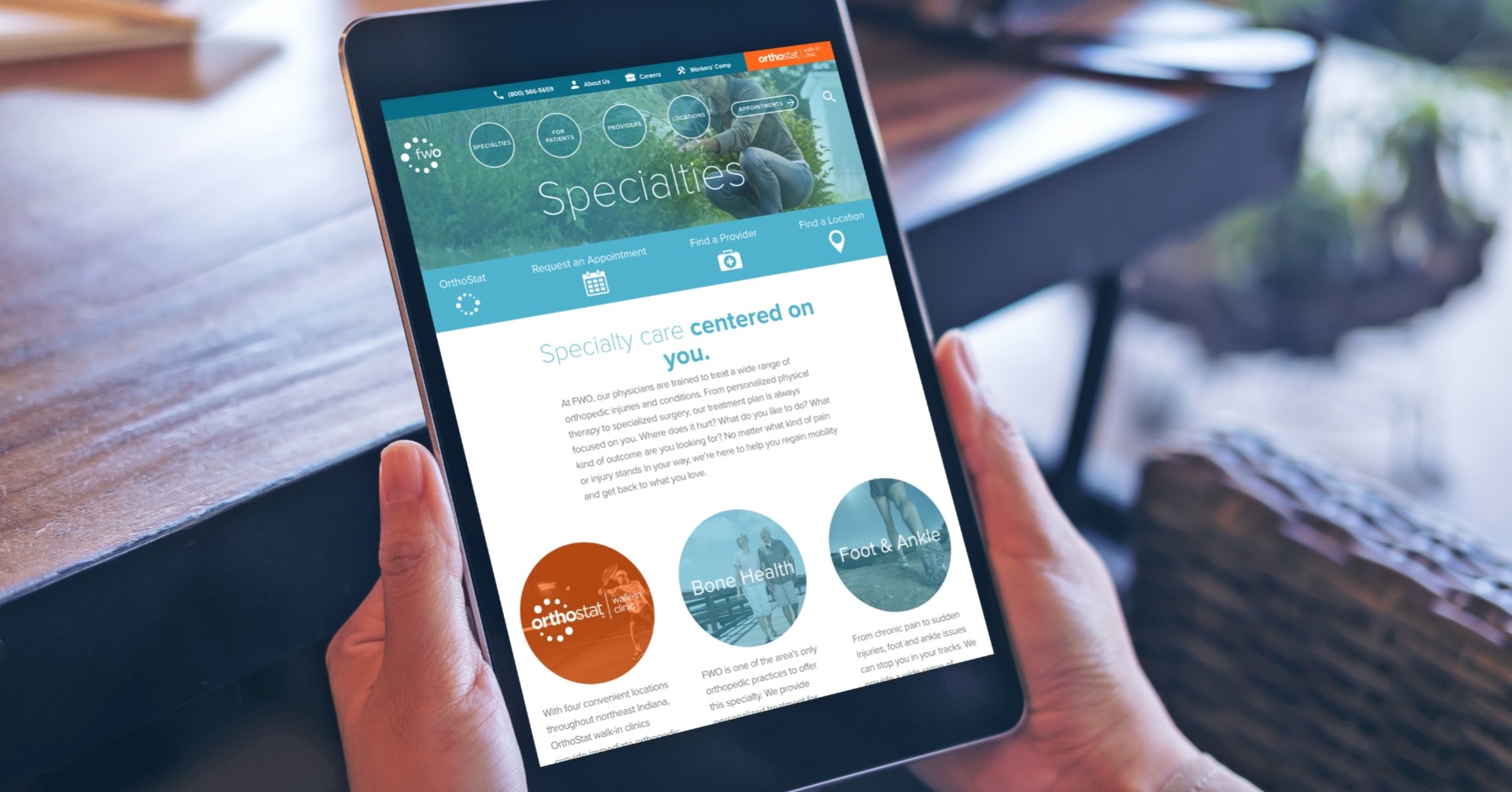
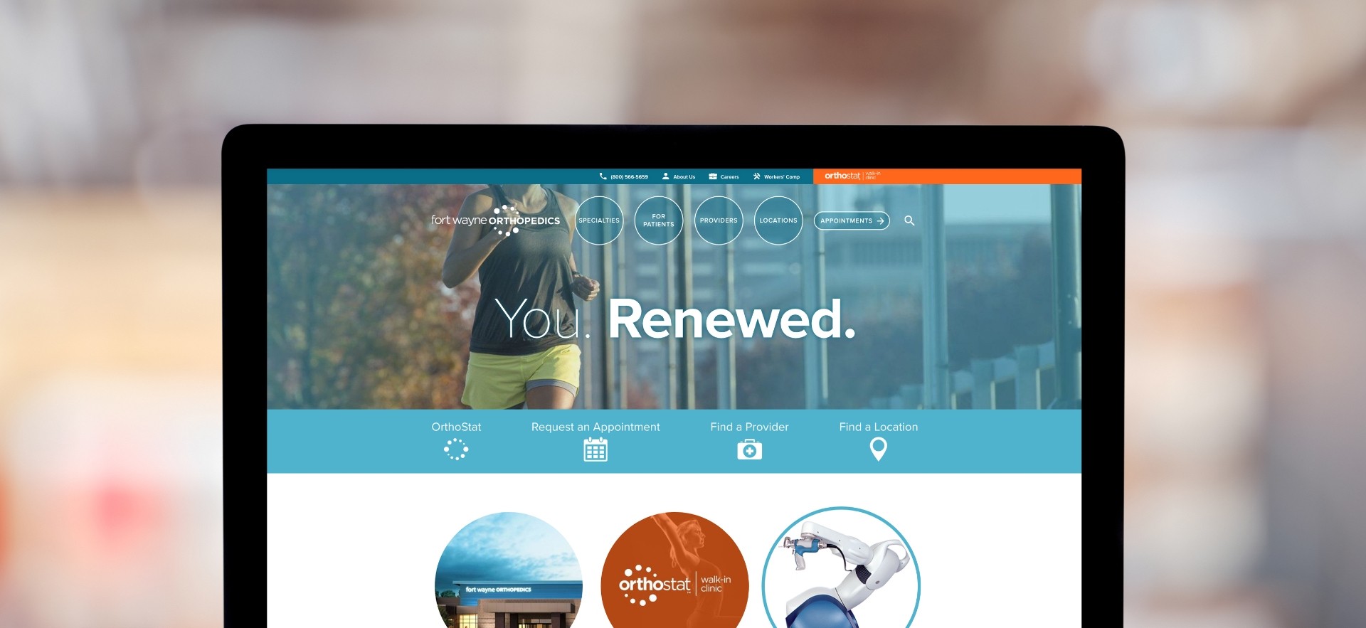
As a longtime partner, Big has helped FWO complete not one, but two website overhauls. The first followed a major rebranding and was built at a time when a most site visitors browsed from desktop computers. But in the years that followed, mobile visitors began to outnumber the rest—and their online experience demanded a new design and carefully curated content.

Discover
First, we looked closely at the FWO site and metrics. Where did visitors click and where did they seem to get lost? What pages had the most traffic and why? Then, we looked everywhere else. What were other, similarly sized specialty practices doing? What were their mobile experiences like? And what best practices could we bring to FWO—or better yet, build upon?
Develop
We put FWO through our extensive process to build the best website possible. To make sure we got it right without leaving anything out, we met with a roundtable of FWO physicians and staff to find out what they needed on the new site, what they liked about the old site and what they were more than happy to let go. Coupling their information with the customer experience map we developed, we created a site map that worked for doctors and patients. Then we designed an intuitive wireframe—with pared-down copy, simplified navigation, and intuitive, patient-friendly tools.
Deploy
With the wireframe in place, all that was left was to code. And test. And code. And test. And finally—go live! The refreshed site checked all the boxes. It was mobile-optimized, easy to use, easy on the eyes and easy for the FWO team to update as needed.

