
By Chad Stuckey
We live in a world of extremes. But brand refreshes shouldn’t be that way. The goal is to find a strategic solution that is just right. If you’re too subtle, people won’t notice the evolution and then miss the positive impact of the update altogether. That’s too cold. If you’re too drastic, the change can go so far that any remnants of the brand are lost and it could even cause a negative reaction. In other words, too hot.
Looking back at 2025, three very popular brands rolled out new looks, with varied degrees of success. As a regular customer of all of them, and a seasoned branding professional, I had a front row seat to watch them unfold.
Walmart
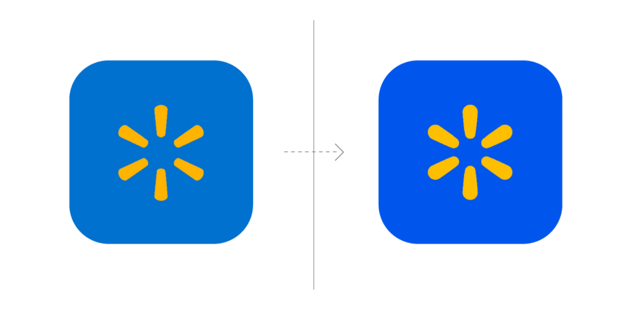
It was back in January 2025 when the retail giant announced a “comprehensive brand refresh.” According to the company, the update was designed to reflect its role in the modern marketplace as the omnichannel choice of millions of customers. They tweaked the wordmark, logomark (the “spark”), color palette and tone. JKR, the brand agency that worked with Walmart, also noted that the design was done with a digital-first mindset.
The result? A brand that’s a bit brighter, a bit bolder (literally and metaphorically I guess). But just barely. The change is very, very subtle, maybe even imperceptible to the average eye. I don’t dislike it—I mean, there’s barely anything to like or dislike. I’m kind of left asking, “what’s the point?” Is it going to yield a tangible return on their digital efforts? And even if it did, where is the impact on all the other touch points along the customer journey? I’m in their stores literally every week, and I’ve been keeping an eye on how the graphic adjustments translate to the in-store experience, or, more importantly, if there’s a shift in Walmart’s messaging. And as a very regular customer, I can honestly say, I’m not seeing anything.
Verdict: Too cold.
Cracker Barrel
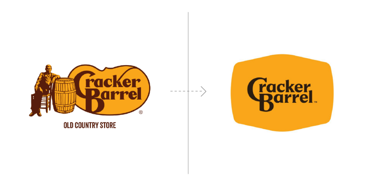
Everyone seems to know about this one. It was all over the news. Cracker Barrel, the restaurant with the descriptor line “Old Country Store” took a dramatic turn with its now infamous 2025 rebrand. The new logo was put in the hot seat immediately. It maintained the colors, but removed the founder and the signature barrel he leaned on and, in the process, threw away all the nostalgic nature the company was built on.
That’s the main issue with this rebrand. The entire story of the company was lost. When you put what they did in the context of Cracker Barrel, it’s a total fail. Remember, this is an eatery where the only thing more cluttered than the menu is the decor in the dining rooms—vintage knick knacks that make you feel like you’re in your grandpa’s garage (as long as your grandpa is a hoarder). Personally, I think the updated logo on its own is clean, modern and cool. Even the new store designs were a fresh approach. But that’s coming from a graphic designer’s point of view. The average customer doesn’t really care about revamped lighting or a simplified wordmark. It’s all about the feeling they have when they eat there. And they want what Cracker Barrel has always given them—comfort, friendliness, Americana. For its loyal fans, a logo that’s stripped down completely doesn’t look modern. It looks barren. And generic.
Speaking of loyal fans, that was another big negative to how Cracker Barrel handled the entire rollout, including their rationale. They kept saying they were trying to appeal to new customers. It made their existing customers feel like they didn’t matter. And when they did try to explain why they went the route they did, they focused on design and spoke in a creative language that didn’t resonate. It was obvious they had not focused on the right audience.
The backlash came fast and it came hard. And it wasn’t just in the form of complaining diners. The value of the company in the rebranding aftermath fell almost $100 million. And on top of that, the debate embroiled the chain in political controversy. That’s a far departure from what the execs no doubt hoped would be the effect of their efforts.
Verdict: Too hot.
Pizza Hut
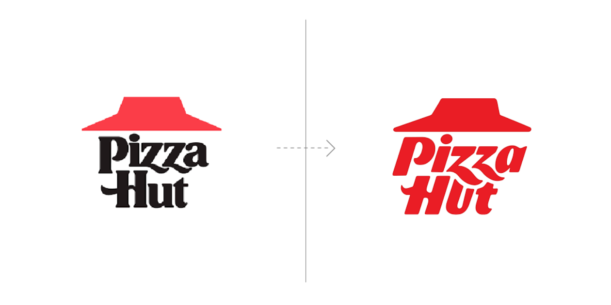
Last on our list is The Hut. (Are you getting hungry yet???) The pizza juggernaut introduced its new look in August 2025. They did it fairly quietly, perhaps not wanting to make a splash after what happened with Cracker Barrel. But for me, they hit the sweet spot. It’s a clear, simple evolution of what the logo used to be. There are some very intentional nods to retro elements, familiar experiences and old design cues. They kept the red, emblematic of their signature sauce, and they maintained the roof line, which is a surefire way to recognize the physical stores. But they opted for a simpler color palette (removing the black) and a more jazzed-up typeface that almost makes it seem like cheese melting into the stacked letters.
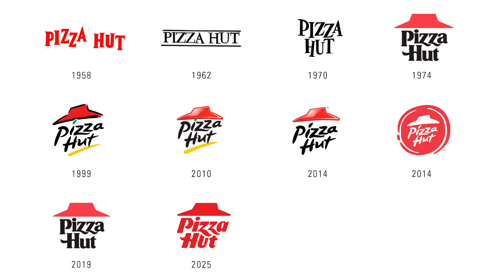
If you look at the evolution of the logo (there have been 14 variations since 1958), most find some attachment to the red roof. It honors their roots and acknowledges the journey of change.
Pizza Hut’s cultural heritage is still there. But I don’t have to squint at it to figure out if something has really changed. I’m still waiting for the full story to unfold. I’m hoping the execution and application across the stores, digitally and beyond will be just as good as the logo itself. A happy medium always satisfies.
Verdict: Just right
In each of these cases, the companies no doubt wanted to usher their brands into a new era. But it’s more than that. In our experience, organizations that want to update their brands are focusing on four objectives:
1. Retain existing customer loyalty
2. Improve practical application and use
3. Facilitate understanding of their product or service
4. Expand their reach
I’d venture to say the first two examples fell short. Even the most successful rebrand in my eyes, Pizza Hut, didn’t connect the changes they made to their overall strategy. In fact, all of them struggled to make the case for how their update reflected a progression in the brand’s story. And if your rebrand lacks strategy and story, it’s hardly a brand.
It’s obvious to reach all your goals, you really need to be intentional with your refresh. You have to be thoughtful with the change. That means knowing your audience and understanding your brand. Be creative. Be objective. Be smart. Be just right.